Showing posts with label Nigel Quarless. Show all posts

Monday, June 5, 2017

Pyramid Hunters - Bones of the Sun God

Had a great time doing cover #2 for the Pyramid Hunters series, published by Simon & Schuster's Aladdin imprint.

The series is like a kid version of Indiana Jones and I love getting to research and illustrate these ancient locations, this one set in the Mayan Temples of Belize.

Thanks to the people at Aladdin for being so great to work with, as usual!


Whatever Floats Your Boat...

Personal piece for fun...


Thursday, January 21, 2016

Red Moon Rising

A cover for Red Moon Rising, a new middle grade cover coming out from Simon & Schuster. It was so cool to have the chance to get into the epic Sci-Fi Western inspired world that author K.A. Holt has created. The Art Director really wanted to capture how bad ass the main character Rae is and to show her rugged, frontier world on a far away space colony. Of course it needed to showcase the huge, blood red moon that inspires the book's title as well.

This was a breakthrough project for me... Not only because I had the chance to work in the Sci-Fi genre, but also because of the scope of the image - the character, horse, environment and bold colour scheme. It was a fantastic opportunity and a really, really rewarding project.


Pyramid Hunters: The Iron Tomb

Here's a cover for "Pyramid Hunters: The Iron Tomb" by Peter Vegas.  I grew up a huge, huge fan of Indiana Jones - and the movies piqued an interest in archeology that would continue to this day. Although I never did become the heroic archeologist/adventurer I wanted to as a kid... becoming an illustrator is a close second - and still requires a lot of research and taking the odd risk! I had an absolute blast on this one. Thanks to the fine people at Simon & Schuster's Aladdin imprint for being amazing to work with, as usual.

Tuesday, April 28, 2015

Hollow Earth: Book of Beasts Cover

Here's a cover for the fantastic "Hollow Earth" series  by John and Carol Barrowman, published by Simon and Schuster's Aladdin imprint. This is for the epic final "Book of Beasts".

The books are about two twins with the inherited ability to make their artwork come to life. Art and historic paintings play a big role in the books as well - how cool is that! For an epic finish to the series, I was inspired by the peak moment where the portal to "Hollow Earth" the subterranean realm where all the creatures of myth and fantasy are imprisoned, has been opened. The book's heroes are beset by the villain riding a black, winged stag with Hollow Earth's creatures emerging behind them.


Thanks to everyone at Aladdin for another amazing project!

Dead City: Dark Days Cover

The Dead City books by James Ponti, published by Simon and Schuster's Aladdin imprint, have been amazing to work on. Here's the cover for the final book in the series, Dead City: Dark Days. My first cover for this series was way back in 2011 and it was my first series for a major publisher, so it's a little bitter sweet to be wrapping up.

The story revolves around Molly, the teen girl protagonist who gets wrapped up in the Omegas, a team of Zombie fighters battling the hordes of Undead that live in an under Manhattan. The books are high action and bring the Zombie genre to a young reader audience in a really fun and smart way while weaving in New York City history and culture. Working with so much great material was an absolute blast. Wrapping up the series with the big finale on top of the iconic Chrysler building was a fantastic way to cap it off!


Thanks to everyone at Aladdin for being so great to work with!

Saturday, November 2, 2013

Eremos


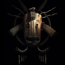
Here are the first images from a new series of works titled “Eremos”

“Eremos” envisions the mythological archetypes of tribal cultures living ages after the fall of civilization.  These Mask designs are early explorations into gods, spirits and motifs for this world.

I’ll be continuing to work on these masks along with more narrative images based on classical mythological archetypes and will post more as they come.

For future news and art, please follow me on twitter and tumblr as well.


Monday, May 20, 2013

Some New Covers

Haven't had a chance to update this thing in a while... between personal work and freelance somethings gotta give.

Here are two sequel covers for the series I've been doing for Simon and Schuster's Alladin imprint, Dead City and Hollow Earth.

These were really great projects, coming back to something I'd done previously and being able to build on what I'd established for the look already but being able to make the images of their own as well. As usual the publisher was awesome to work with and I had a lot of freedom to run with ideas on these.

Dead City: Blue Moon


Hollow Earth: The Bone Quill


Monday, June 20, 2011

Mixed Bag Mythography III

Mixed Bag Mythography III - Nigel Quarless by NigelQuarless

I’ve finally managed to update after a few months... been busy on some projects that I can’t release just yet. What I can show is this piece I did for fun during the down-time in between jobs.

I love African masks and thought they'd be great inspiration for a Mixed Bag Mythography piece. This mask is mostly inspired by the styles of the Igbo culture from Nigeria. The character is a kind of priestess or shaman inspired by Obeah, a form of folk magic and sorcery practiced in the West Indies of Igbo origin. What exactly she’s doing with the mask I’m not sure of, I'll leave that for you to decide.

As far as updates go... I'll have a piece published in Spectrum 18 due out in November. I always feel honoured to have any work selected to be shown amongst so many talented artists and this year is certainly no exception.

I'm a little late on posting this news, but I've also got a few pieces in the "Gorilla Artbook" published by the fine folks at CFSL Ink. Gorilla Artfare is an online community of artists that I've been a part of for over 5 years now. It's an incredibly talented group and I've made many great friends there. Last year, the talented Aurelie Neyret spearheaded a book project with work submitted from all the GA artists and the Gorillas went all out on making it happen. Thanks in particular to Aurelie, Victoria Maderna, Federico Piatti and the folks at CFSL. The book is beautifully designed and laid out and filled with awesome work from start to finish. You can check out a preview and order it online at cfsl-ink.com

That's it for now, thanks for looking, I’ll be posting some more work and projects soon...

Tuesday, January 25, 2011

Isis

Here’s a new personal piece that I’ve been working on sporadically over the last few months. I started it way back in June and although I initially put it down, after getting swamped with work and life it ended up being my go-to piece for the shorts breaks I’ve had in between projects when I was too burned out or uninspired to start something new.

Although I kept the working title of Isis, it’s not too firmly based in Egyptian mythology. The figure takes some inspiration from the classic depiction of Isis but from there I mixed up the symbolism a bit and tried to evoke a visceral sense of the cycle of life, death and rebirth.

IsisNigelQuarless2011LowRes

IsisFinalWebCrop

Wednesday, October 20, 2010

Fox & Phoenix Cover

Well, after an extremely busy few months I'm really excited about this post - a cover for a brilliant young adult novel titled "Fox & Phoenix" by Beth Bernobich.

Fox&PhoenixNigelQuarless

I was approached by Jim Hoover, an art director at Viking Press who thought I'd be a great fit to illustrate this southeast asian inspired world where the people have spirit animal familiars and the technology is powered by magic flux.

The concept was to have the two main characters and their familiars entering a bustling city filled with people, lights and magic and being a bit overwhelmed by it all. I put the characters into a dark, narrow alley that almost feels like it's going to close in on them, played up their distinct personalities and brought the city to life with lots of atmosphere and bright neon signs.

I really enjoyed getting my head into this world and bringing it to life and working with Jim was a real pleasure. This was a super fun and rewarding project from start to finish and I'm really happy with the result. It's scheduled for a Fall 2011 release and I can't wait to see it on the shelves!

Monday, May 17, 2010

Gallery Page Added

Hey hey...I've been crazy busy at work for over a month, so I haven't been able to finish any personal work lately. I did, however, put a selection of my finished work from 2007 to present into a Gallery page. I've been adding alot more work-in-progress stuff and sketches lately, and it's bogged down the blog a bit for anyone who'd like to get right to the goods, so now it's all in one place, HERE.
You can also access the Gallery by clicking the Gallery Link in the top right corner of the home page.

This image is an old one that got tweaked a bit before I submitted it to Spectrum. Turns out it's the one they chose to publish in Spectrum 17.

WolfSpiritNigelQuarless09Web

Friday, April 23, 2010

White Widow

For some reason, "White Widow" got in my head, so I did a sketch inspired by it over a couple nights this week. I may take it further, but would probably end up liking the rough better as usual, so we'll see...

WhiteWidow01_72dpiNq

Tuesday, April 13, 2010

Finished Up...

Spent the weekend finishing up and tweaking a few pieces.

Hard to know when to call this one finished... it's a bit minimal in tone so I didn't want to overwork/ overtighten.

Solace_72nq2010

I put this one away a little too early to feel good about it for long... now I think I've done all I can do with it.

Carry_72nq2010

I was okay with where this was at, but while I was in the finalizing mindset a gave it another hour or two to fix a couple things that were bugging me.

Death2_nq72_2010

click the thumbs for a larger image from Flickr. That's all for now...

Sunday, April 4, 2010

News and Art...

Happy to say I'll have some worked featured again in Spectrum 17. Not sure which piece or pieces yet... I submitted 3 images this year. Can't wait to see what made it in.

I've been finishing up this image for the last week or so. I had tried this idea out last year with some pretty mixed results... mixed meaning, well.. kinda shitty and overworked...so here's another attempt.

MbmII_72dpi_NigelQuarless2010

A little something I wanted to make note of involving the process on this one...

When I sat down to draw this, I grabbed a blank sheet to scribble on a bit to warm up my hand. What I ended up doing on it was blind contour drawings of the reference I'd printed out. I just focused on the contours in the ref and felt them out on the paper getting a feel for the rythm and flow. It ended up being a really enjoyable exercise and I think it'll become a regular thing. I loved the feeling of just putting down the lines without getting all tight and overworking them.

BlindContourRef72

When I'm warmed up for the real drawing, I've absorbed the contours and have the reference images more in my head - my lines are then more likely to keep some of that looseness. I'd recently read Itten's Design and Form and thought his thoughts on warming up and preparing for work were gold.

From Johannes Itten's "Design and Form"


"My first morning periods in class begin with relaxation-, breathing-, and concentration exercises to establish the intellectual and physical readiness which make intensive work possiblee. The training of the body as an instrument of the mind is of great importance to a creative person. How can a hand express a characteristic feeling in a line,when the hand and arm are cramped..."

There's a few other real pearls in there too. I found his Art Of Colour to be a worthwhile read as well.

Friday, March 12, 2010

Carry On...

Well this turned out a bit awkward all around, but whatever...I'm pretty much done with it. I dropped the overall saturation - except for on the bird to pop it out a bit. I also changed the lighting a bit to cast it up on the baggage and the dude's face more - those things both helped it out.

CarryOn_72dpiNQ

Saturday, March 6, 2010

More Thumbs and Progress...

Here's a couple colour thumbs from the last week. The one withthe tree shows how great these are for idea development, as I think it improves on the previous version in a few ways... more story, more interesting mood, more compelling.

DeadKingClrThmb72dpiNQ

This one came out of some interesting ref. I like the small hits of light.

WellClrThmb72DpiNQ

and here's the progress on this one. It's just about there...

CarryWIP11_72DpiNQ

That's all for now. I hope to wrap the last one up this weekend, and I've got a few more pencil thumbnails that I'd like to throw colour on... just need to find the time.

Wednesday, February 17, 2010

Death

Here's one of the sketches from last post that I worked up. I tried to keep it loose overall and only tighten up a bit more in the focal areas.

TouchOfDeath_NigelQuarless_72dpi

Sunday, January 17, 2010

Neon Dragon Final

So here's the final version of the Neon Dragon piece I've been chipping away at for the last month or so. It actually turned out to be much more of a learning process for me than I had planned, and the piece really benefitted from getting workshopped a bit. During the process I got some great input that helped me make up for some poor planning the piece suffered from in the early stages and highlighted some areas I need to focus on to push my work forward. It showed some promise as far as process and technique goes as well. There's more on that after the image, which will link you to my Flickr account where there's a larger size as well...

NeonDragon_NigelQuarless10_72dpi

Back in December when I started it, I began thinking about major areas in my work and process that I'd like to work on for the coming year, I've been meaning to make note of them for a while and now that this is done, it's a great example of what is working and what isn't for me right now.

So here's a sort of manifesto/ art resolution for me going forward.

1 - Theme.
I need to always clearly establish a theme for any given piece I start...even for fun, personal work. My personal work in particular has often started with an image in mind, and gone from there, working in or just hinting at theme as I go. Instead I need to sort out exactly what my theme is first, or right after my initial thumbnail or idea, and then decide how I want the piece to communicate that. This should help keep the work focused and cohesive, as well as help make decisions for everything from composition, colour and design details to gesture and expression. It's what will make work compelling, rather than just an interesting image.
2 - Reference
In the last year or so I've really learned alot about how important good reference is, and I've loosened up a bit about how much I use and how necessary it is - even for less realistic work. Getting the right reference for a piece and using it without being a slave to it is key. I've been shooting my own for a while now and it's helped tremendously. I need to carry on with that and take it further - really spend the time to get what I need to serve the piece, not make the piece according to the reference that I have available. That means getting the right acting, costuming and lighting. I'm hoping this will help with some anatomy issues that seem to continually creep in to my stuff, I need to know how poses look in reality before I tweak them. Lighting and details in reference will also help to push my work into a more immersive, compelling reality of it's own.

3 - Posing and Expression
This ties in with the Theme and Reference points but deserves mention on it's own as it's really important. Once theme is established, the first thing I need to do is decide what my characters are communicating, and how to express that through gesture and expression. If I have characters interacting, I need to make sure they actually look like they're interacting, and compose the piece accordingly. This means making decisions and not trying to show too much sometimes - which is what I didn't do early on in the Dragon piece and it was a major setback.

4 - Tones
I've been starting to become more aware of tones and the relationship between tones. I've read from some really impressive artists that tones and tonal relationships are really important in creating realism. Using more reference and doing some studies will help with this.

5 - Saturation
I do like working with bright, vivid colours, but that can lead to over saturating the entire image sometimes. With more attention paid to contrasts of extension and balance in my colour work I can have areas of colour pop out more and the piece can be more realistic and dynamic. Working up from desaturated backgrounds to the foreground and hitting areas of interest with the highest levels of saturation and contrast will help.

6 - Perspective/Compostion
This goes along with not making decisions and trying to show too much - I sometimes end up defaulting to safe angles and compositions. With theme established, I need to decide who or what the primary subject is and choose an angle and compostion that best communicates that - in a way that is fitting with the mood of the piece, be it dramatic, static, dynamic, etc.

7 - Texture and Materials
Also tying in with reference, paying more attention to rendering texture and materials will help make my stuff more plausible and immersive. Really paying attention to how highlights break up and falloff is key. I'm not happy with my mark making as well. The right brushes and materials will help, but it's probably also just something I'm going to develop over time as I work at it. Like anything, the more experienced, comfortable and confident you are at something, the more style and expression can come through.

I think that's all I have on my mind for now - it's plenty to work on. Hopefully by taking the time to write all this out, It'll be more firmly established in my mind, and I'll refer back to this to remind myself once in a while.

Thanks for looking...

-Nigel