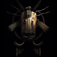
Back in December when I started it, I began thinking about major areas in my work and process that I'd like to work on for the coming year, I've been meaning to make note of them for a while and now that this is done, it's a great example of what is working and what isn't for me right now.
So here's a sort of manifesto/ art resolution for me going forward.
1 - Theme.
I need to always clearly establish a theme for any given piece I start...even for fun, personal work. My personal work in particular has often started with an image in mind, and gone from there, working in or just hinting at theme as I go. Instead I need to sort out exactly what my theme is first, or right after my initial thumbnail or idea, and then decide how I want the piece to communicate that. This should help keep the work focused and cohesive, as well as help make decisions for everything from composition, colour and design details to gesture and expression. It's what will make work compelling, rather than just an interesting image.
2 - Reference
In the last year or so I've really learned alot about how important good reference is, and I've loosened up a bit about how much I use and how necessary it is - even for less realistic work. Getting the right reference for a piece and using it without being a slave to it is key. I've been shooting my own for a while now and it's helped tremendously. I need to carry on with that and take it further - really spend the time to get what I need to serve the piece, not make the piece according to the reference that I have available. That means getting the right acting, costuming and lighting. I'm hoping this will help with some anatomy issues that seem to continually creep in to my stuff, I need to know how poses look in reality before I tweak them. Lighting and details in reference will also help to push my work into a more immersive, compelling reality of it's own.
3 - Posing and Expression
This ties in with the Theme and Reference points but deserves mention on it's own as it's really important. Once theme is established, the first thing I need to do is decide what my characters are communicating, and how to express that through gesture and expression. If I have characters interacting, I need to make sure they actually look like they're interacting, and compose the piece accordingly. This means making decisions and not trying to show too much sometimes - which is what I didn't do early on in the Dragon piece and it was a major setback.
4 - Tones
I've been starting to become more aware of tones and the relationship between tones. I've read from some really impressive artists that tones and tonal relationships are really important in creating realism. Using more reference and doing some studies will help with this.
5 - Saturation
I do like working with bright, vivid colours, but that can lead to over saturating the entire image sometimes. With more attention paid to contrasts of extension and balance in my colour work I can have areas of colour pop out more and the piece can be more realistic and dynamic. Working up from desaturated backgrounds to the foreground and hitting areas of interest with the highest levels of saturation and contrast will help.
6 - Perspective/Compostion
This goes along with not making decisions and trying to show too much - I sometimes end up defaulting to safe angles and compositions. With theme established, I need to decide who or what the primary subject is and choose an angle and compostion that best communicates that - in a way that is fitting with the mood of the piece, be it dramatic, static, dynamic, etc.
7 - Texture and Materials
Also tying in with reference, paying more attention to rendering texture and materials will help make my stuff more plausible and immersive. Really paying attention to how highlights break up and falloff is key. I'm not happy with my mark making as well. The right brushes and materials will help, but it's probably also just something I'm going to develop over time as I work at it. Like anything, the more experienced, comfortable and confident you are at something, the more style and expression can come through.
I think that's all I have on my mind for now - it's plenty to work on. Hopefully by taking the time to write all this out, It'll be more firmly established in my mind, and I'll refer back to this to remind myself once in a while.
Thanks for looking...
-Nigel
